The useful question in trend coverage is not, “What will definitely sell next?” It is, “What does this signal tell us about how people discover, compare, and feel confident enough to buy?” That difference matters for ecommerce teams, brand sites, landing pages, and content operations.
The collected source set was narrow. Yahoo News carried NET ViVi coverage about trend items and select shops, while another Yahoo News item from @DIME covered the squishy product “Melojoy” in a youth-oriented context. Those sources are not enough to prove broad market demand, sales volume, or demographic reach. They are useful, however, as practical signals for improving product discovery and page design.
Read the reason to buy, not just the headline
A trend word does not become a strong page simply by appearing in a title or category. Teams need to separate four layers: category, use case, emotion, and evidence. Category is the product grouping. Use case is when and why someone would use it. Emotion is the reason it feels attractive, safe, timely, or giftable. Evidence is the information that reduces hesitation: photos, video, reviews, size, materials, care notes, safety notes, stock, and return policy.
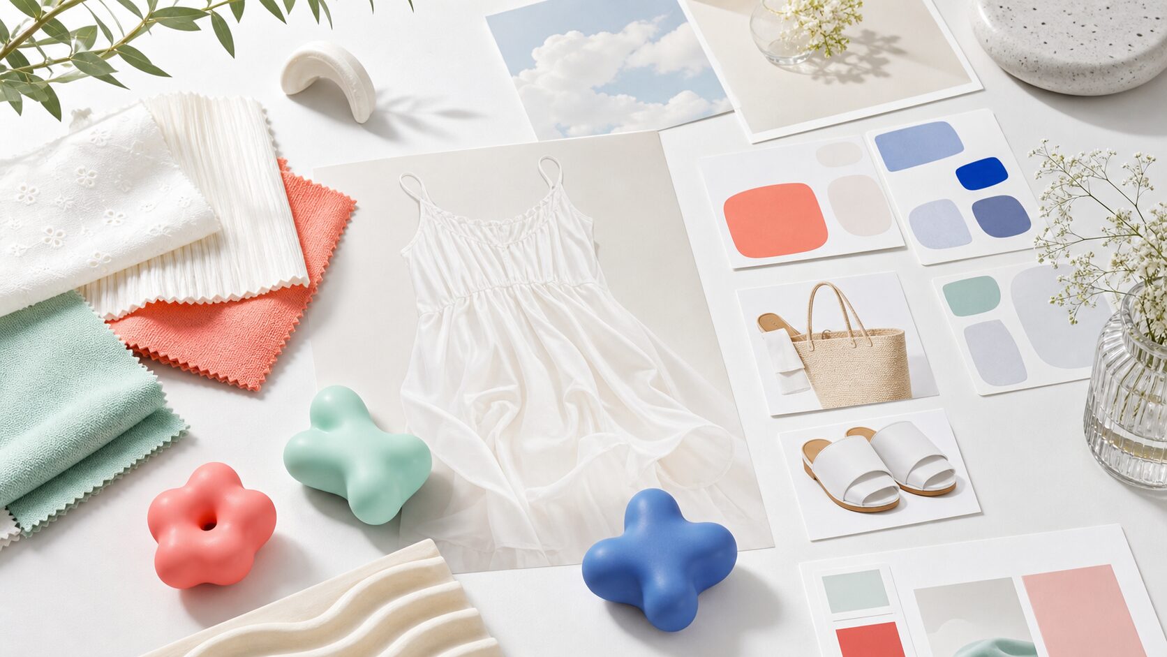
Select-shop coverage points to curation. Users often want fewer choices, clearer reasons, and a faster path to something that fits their situation. Squishy-toy coverage points to sensory experience. A static product image may not explain softness, rebound, scale, sound, portability, or collectability. These are different signals, but both ask the same operational question: what information is missing from the buying journey?
Select-shop trends reward editorial navigation
Select shops are not valuable only because they contain products. Their value is the editorial angle: “these items go together,” “this is useful for this situation,” or “this is a safer starting point for a first purchase.” Ecommerce sites can use that logic without pretending to be a magazine.
Instead of publishing thin trend pages, build maintainable features around concrete use cases: small gifts, rainy-day items, travel-friendly choices, light-colored outfits, seasonal refreshes, or beginner-friendly selections. Link those features to product detail pages, size guides, returns, reviews, and related FAQs. The goal is not to create more pages; it is to create fewer dead ends.
Squishy-toy trends need digital sensory support
A squishy product such as Melojoy depends on qualities that are hard to judge from a still image. Softness, shape recovery, size in the hand, sound, scent, surface texture, and color variation all affect the decision. If the product is presented to younger audiences, the page also needs clear safety and usage information for people making or supervising the purchase.
Short video, hand-scale photography, material notes, recommended age, care guidance, gift use cases, and review excerpts can work together. Accessibility matters here as well. Do not rely only on color to distinguish variants. Explain the important points in text even when a video or social embed is present. That makes the page easier to understand and easier to search.
A practical planning table
| Signal | Likely user need | Page response |
|---|---|---|
| Select-shop coverage | Less effort in choosing and more confidence in recommendations | Create use-case features, editor notes, related products, and FAQ links. |
| Trend-item coverage | A current-looking choice without unnecessary risk | Show materials, size, usage scenes, comparison points, and return policy. |
| Squishy toys | Understanding tactile appeal before purchase | Add video, hand-scale photos, material details, age guidance, and care notes. |
| Youth-oriented buzz | Shareability plus reassurance | Separate short social-friendly presentation from clear safety and purchase information. |
Checks for production teams
- Review whether category names match real search phrases and use cases.
- Update existing category, product, FAQ, and review paths before creating a new feature page.
- Use words such as “popular” only when the evidence supports them.
- Translate visual information into body copy, captions, and alt text where it helps comprehension.
- Keep pages understandable even when video or social embeds are unavailable.
- Define when trend pages should be refreshed, merged, redirected, or retired.
Design for easier choice, not more buzzwords
Trend coverage is useful when it helps teams improve the buying journey. Select-shop signals call for stronger curation and internal navigation. Squishy-toy signals call for richer experience explanation. Both can improve ecommerce content when they are translated into specific page elements rather than copied as loose buzzwords.
The best response is usually not a large batch of trend pages. It is a cleaner path from discovery to reassurance: a relevant feature, a detailed product page, useful media, accessible descriptions, and internal links that answer the next question before the user has to search for it.
FAQ
Should every trend article become a new landing page?
No. Many trend signals can be handled by improving existing categories, product pages, FAQ sections, and internal links. Create a new page only when there is a durable use case and a clear maintenance plan.
When is it safe to call something popular?
Use that word when there is evidence such as sales data, rankings, official statements, review volume, or consistent coverage from multiple sources. Otherwise, use more cautious wording such as “featured,” “receiving attention,” or “covered as a trend.”
How can tactile products be explained online?
Use short video, scale photos, material notes, use cases, cautions, and review excerpts. The important information should also be available in text, not only in video, audio, or color.
Sources
- Yahoo News / NET ViVi: trend items and select-shop coverage
- Yahoo News / @DIME: coverage of the squishy product Melojoy