Summer accessories are a category where consumer attention moves quickly. A NET ViVi article carried by Yahoo! News highlights summer accessories that stylists are watching, showing how small items such as accessories, bags, hats, and sandals can change the impression of an entire outfit.
For ecommerce and brand teams, the practical question is not simply which items are popular. Accessory trends can become a useful entry point for improving product photography, recommendations, search paths, editorial content, social landing pages, and accessibility. The goal is to turn short-lived attention into a better buying experience.
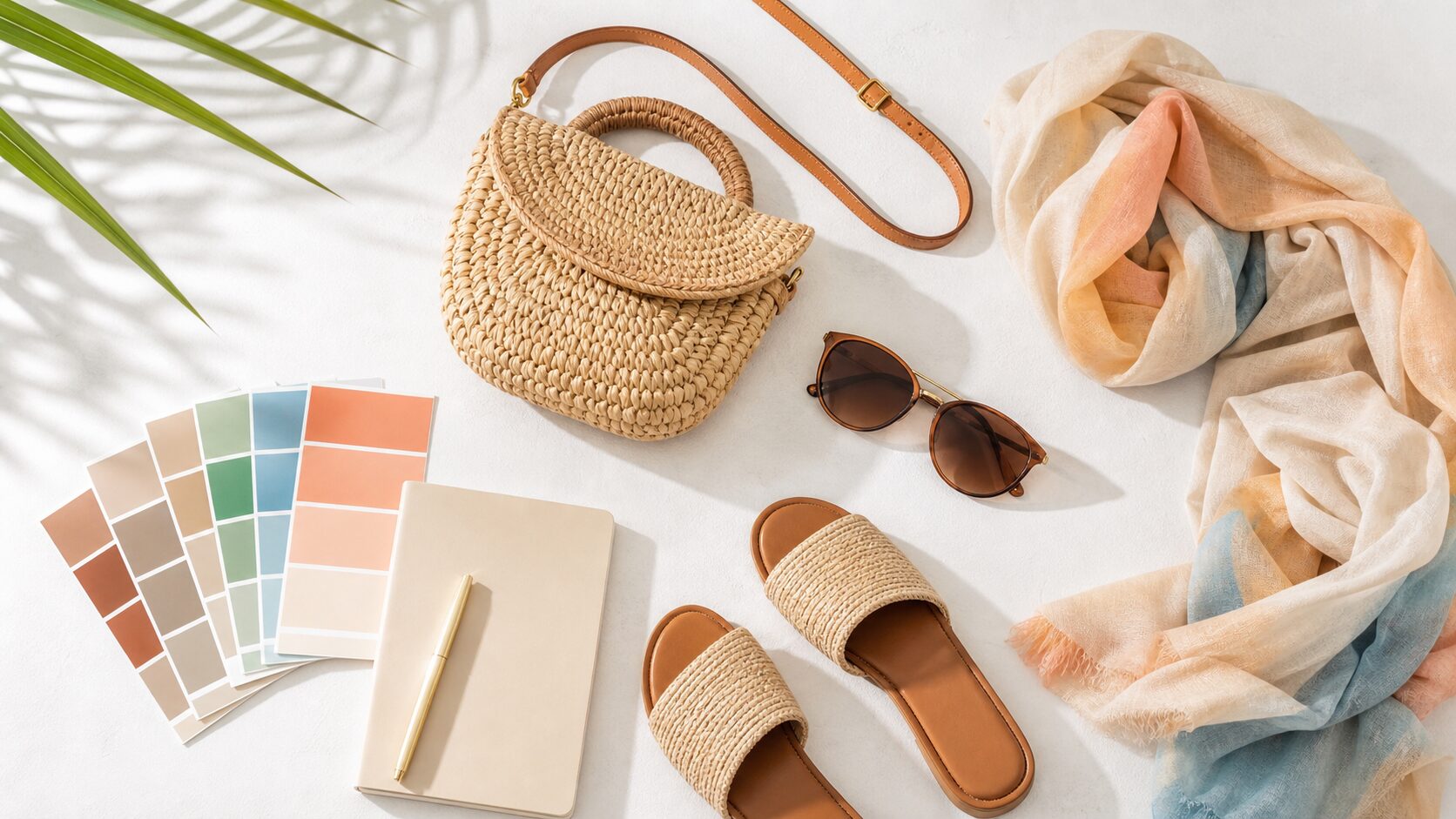
Accessory Trends Reduce Pre-Purchase Uncertainty
Accessories are often lower-commitment purchases, but customers still need confidence before buying. Color, material, scale, weight, and styling context all affect the decision. In summer, shoppers may also care about lightness, outdoor use, travel, events, and comfort in warm weather.
A product page should therefore show use cases before it relies on specifications alone. A shopper can understand the item faster when the page shows how a small bag fits into a commute, how a color works with a white shirt, or how a hat looks in bright outdoor light. This is not decorative content; it is part of the user experience.
Five Product Page Elements to Review
- Use scenes: Add photos that show how the item works with clothing, bags, or daily objects.
- Size comparison: Use familiar references such as a hand, phone, or tote bag to communicate scale.
- Color and material detail: Describe shine, transparency, matte texture, or woven surfaces instead of relying on color names alone.
- Styling paths: Recommend combinations because they fit a situation or mood, not just because they share a category.
- Returns and exchanges: Make sizing, color, and return information easy to find before checkout.
Build Trend Pages Around Use Cases
A seasonal feature page may attract search and social traffic, but a list of trend words rarely helps customers choose. Instead of organizing everything under a broad trend headline, divide the page by situations: travel, commuting, weekend outings, festivals, beach days, or protection from strong air conditioning.
Inventory planning also matters. Fast-moving accessory trends can leave a landing page filled with unavailable products. Alternative items, restock notices, similar colors, similar materials, and comparable price ranges help keep interested shoppers from leaving.
Accessibility Directly Supports Accessory Commerce
Because accessories often differ in subtle visual details, alt text, color names, material descriptions, and button labels carry real commercial value. An image alt text such as “bag” is too thin. A more useful description might explain that the image shows a pale green compact shoulder bag styled with a white shirt.
Interfaces should not rely on color alone to communicate product status. Availability, low stock, and restock states should be written as text. Size charts and material tables should be provided as HTML tables or lists rather than flat images so that search engines and assistive technologies can understand them.
Metrics Worth Tracking
A trend feature should be measured after publication. Useful signals include product-detail click-through rate, add-to-cart rate, internal search terms, clicks on out-of-stock items, return reasons, and scroll depth on the feature page. These numbers reveal where shoppers hesitate.
If the team only measures short-term revenue, the learning disappears when the trend fades. Track which photos earned clicks, which combinations led to purchases, and which explanations reduced returns. Those lessons can improve the next seasonal campaign.
Practical Improvement Checklist
- Does the first view show a real use scene rather than only an isolated product?
- Are color, material, and scale explained in text?
- Are related products selected because they work together, not only because they share a category?
- Is there a useful path when a trend item is out of stock?
- Does image alt text help with product judgment?
- Can readers arriving from social posts move quickly to product details or styling examples?
FAQ
How close should a trend article be to a product page?
Keep the article natural, but place clear paths to related products or styling examples near the moments where interest is likely to rise. A softer, well-timed path is usually more useful than repeated sales pressure inside the text.
Are short-term trend articles useful for SEO?
They can be, but only if they are not built solely around a passing keyword. Themes such as seasonal styling, color combinations, materials, and gifting can be updated every year and improved over time.
Is adding more photography enough?
Not by itself. The important question is whether each image answers a different buying question: front view, styling, capacity, close-up material detail, and color in natural light all serve different roles.